Wednesday 30 November 2016

Drawing Tuesday :More Coral at the Beaney


 Drawing Tuesday this week  was at the RAF Museum , Hendon, a bit too  far  for me  to get to easily and anyway I needed to take my laptop into Canterbury  for repair ( tracker pad and internet not working) .So instead I went back to the Beaney and after my fascination with coral at the NHM, found some different structures to sketch. I only had about 45 minutes, the one below will have to wait for my next visit !  


 I walked a different  route from usual from the repair shop into the city, past the Castle  and  lots of interesting  shops. I was lured into the  Stark Gallery and couldn't resist these earrings made from old  watch faces

 Nor could I resist this combination of peeling paint - enough inspiration for a whole series !
A very satisfying day out  and I've just had a phone call to say that my laptop is ready to pick up , all fixed for £35 'MOT'  


Monday 28 November 2016

Advanced Painting: More Mussels and Transcription


 Before my Advanced Painting class on Friday  I prepared a couple of  quilted pieces  with photos of the outside and inside of a mussel shell  printed onto black t-shirt transfer paper applied to a  fabric background (monoprinted or  printed photos of shibori/sand ripples. My intent was to extend the patterns from within the shells to their surroundings, embedding them.  More work is required  but I'm excited by the possibilities. Next step scaling up! There was a lot of interest from the others in  my class on using  textiles  to paint on.

 I also did some more work on the  canvas  from a couple of weeks ago, building up more layers , again more work required.
 The focus of the lesson  itself  after a pep talk on strategies for working was on 'transcription ' copying artwork and making it your own  , looking at the techniques used but also as  a springborad for your own ideas


  We looked first at Kehinde Wiley's interpretation of David's Napoleon  then discussed how to 'steal like an artist'   like Picasso did!
  A bit of fun looking at the  pastiches of Edward Hopper's ' Nighthawks' ( original at the top) . It's actually quite difficult to find a picture of the original if you google it, there are so many parodies!  But  you could  use a detail, the colour scheme , the composition  and  produce  something completely different.

Eileen Cooper  spent some time as artist-in residence at Dulwich Picture Gallery  and   you can see some of the influences of looking at the paintings there in her  work but it is uniquely hers


  The  optional exercise was to  copy Titian's Bacchus and Ariadne  looking carefully at composition  and tone. I didn't do it myself as I was absorbed by the  mussels  but there were some very varied and interesting results from those that did  from random colour choices ( but observing tones) to broad expressive bush strokes.  It reminded me how much I  learnt drawing from the masters at the National Gallery, so much I did it twice!  And   just rediscovered from the books in storage is this book which features some of my drawings.

Thursday 24 November 2016

Drawing Tuesday: Coral and RA Abstract Expressionism

  Drawing Tuesday this week   was at the Natural History  Museum , an afternoon session to try and avoid the hordes of school groups. It was still pretty busy though  and 3 of us found a quieter spot at the end of a corridor   and drew an enormous coral . It was very easy to get lost in the folds  but it was very rewarding to see it gradually take shape on the paper.  I used just a 4B pencil but wished I'd left  more areas undetailed like the drawing of the vase at the British  Museum.  I did  a quick sketch  ( below)  of some of the texture- so  much inspiration for stitch!


In the morning I went to the Abstract Expressionism  exhibition at the RA. Absolutely fantastic and worth the steep entrance fee  to see work on such a grand scale -  photos just don't do them justice . I didn't pick up an audio guide as I wanted to discover them for myself and walked quickly through the whole exhibition before zoning in on what grabbed my attention and why.  I made lots of notes and have ordered  the catalogue .  Meanwhile , do look at the teachers resources ( primary and secondary ) for the exhibition , so many good ideas. There were quite a few school groups  there - it was interesting to contrast their behaviour in different galleries - they were  lively  observing the Jackson Pollock and   calm and meditative   in the Rothko room, (  I could have spend all day there)  

Among the artists whose work I already knew there were several new to me, the one that intrigued me most  in terms of techniques to try was the collage work of Conrad Marca-Relli.

I wonder what the term is for artistic indigestion?! I've seen so much wonderful art and exhibitions over the last few weeks , I'm having difficultly concentrating, my head is so full of ideas I don't know where to start

Monday 21 November 2016

Advanced Painting - visit to Tate Britain

 Friday's  Advanced Painting class was held at Tate Britain, choosing 3  paintings you liked that  were powerful in some way and 1 you don't like but also powerful . Making notes and a sketch  you  looked at the emotional/intellectual content  or meaning and what the painting attempts to say about the subject. Then analyse how the artist has achieved these through composition, tone, surface/paint handling ( noting techniques eg impasto, glazing use of colour , background, details, clarity/ambiguitiy, mood and atmosphere.  Finally to ask yourself how you might treat a painting of that subject.
All this in a couple of hours, quite a tall order ! 
  I started with Prunella Clough's 'Wire and Demolition.'  It brings to mind the remnants of  houses ,  wallpaper and wires exposed to the elements, sometimes suspended in midair. The  underlying beige canvas showed through the background suggestive of rough plaster and bricks with lots of splattering, scrapes and brush marks but very subtle. You can't make out the individual strands of the 'wires' some of the negative shapes echoing the brickwork.
  Many paintings work just as well as a black and white tonal study ( see the John Piper  further down)  but the bright  colour here makes it much more exciting  with the dual focal points and the way your eye travels around the painting.

I spent so long with this one, the rest were a bit rushed. Next was Wilhelmina Barnes-Graham 'Glacier Crystal Grindwaald' The multiple viewpoints and different ways the paint was used to indicate solidity and transparency  was masterful. Trying to sketch it was  difficult, so  many lines and overlapping shapes  along with interesting repetition of colours . 


 An even briefer look at John Pipers' St Mary in Bristol' , great composition, strong contrast with dark and light, variation in brushstrokes and mark and the use of colour
 The painting I didn't like ( because of it's subject matter )  was FN Zouza 'Crucifixion'  but  it was certainly a powerful ,raw , jagged depiction  with the use of paint reflecting the deeply disturbing subject matter.
 Nearby  was this Terry Frost piece  which  someone else was drawing otherwise I would have chosen it as one of my favourites
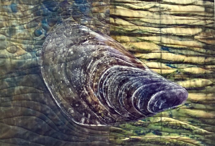
 Meanwhile I've been playing with different ways I might interpret  mussels and limpets on a monumental scale, combining photos with aquatints or indigo shibori. 
 So much art  and inspiration spinning round in my head !!


Monday 14 November 2016

Advanced Painting: Symbolic Colour ( and some mussels)

 This week in 'Advanced Painting' , following on from looking at colour strategies, we had an introduction to symbolic colour, where it isn't naturalistic.
Among the examples looked at were: Peter Diog ( above) , the colours giving an unsettling feeling; and Chagall's use of colour , pattern , composition  with focal point and leading round the picture.

 We spent some time discussing this painting by Eileen Cooper: the use of the 3 primaries, outlining in blue the same tone as the red  with highlights in yellow and  the close cropping of the composition. Also this Mattise picture: use of complimentaries,  strong lights and darks.
There was then a demo  with mixing colours  in 3 tones and then using them randomly ( with some interesting results 

I didn't do that exercise however (though I might have a go at home) as after various sketches   and studies  of boats (  above is the  study on  a piece of old quilt which I did last week ) , I've finally settled on working with  mussels.

Inspired by Paul Nash , I took lots  of photos in close-up of some shells and played around collaging them onto photos of  sand ripples,  developing ideas about how I might integrate  the patterns of lines.

 Using  one of the sections of gessoed old quilt I did earlier in the week, I sketched out a mussel - the quilt patterns are a bit overwhelming at the moment, it needs more work . So in the meantime , I did a quick study on an A3 canvas. This also requires more work as  it's a bit too realistic  for my taste.  Bearing the 'symbolic colour' flavour of the session, I did some playing around in Photoshop ( version at the top of this post)  which shows some potential.  
And after a weekend at the inspiring   West Country Quilt and Textile show in Bristol,  with such a positive response to my indigo shibori ' Voice of the Waters' ( which I wasn't quite sure about) , I've been dreaming about how I might use   indigo ripples to construct mussels. I haven't quite worked out yet how I'd piece them.  


Friday 11 November 2016

Quilts on Display this Weekend

 
  This weekend I will have  at least 10 of my quilts on show at  2 different venues within Europe!
International Threads  ' Challenges' will be  in Munich  from 11.11 to 3.12.  Besides the 7 that have already toured  to several shows  I sent 2  new ones to Uta last week  which have arrived safely and will be used to refresh the collection and retire some pieces.   
'Signs and Symbols'

 'Green'
 

Then at the West Country Quilt and Textile Show  in Bristol, Cwilt  Cymru's exhibition on the theme 'Cynefin'    will be shown for the first time . Ian and I are travelling there on Saturday to help steward. And if that wasn't enough, my quilt 'Eroding Margins'  ( below)   will also be there as part of CQ 'On The Edge'  exhibition.  I've not been before but it looks like  it should be an interesting show,  with contemporary quilts well represented.  
All 5 of the quilts shown above were made this year - pretty good going considering   our move and Ian's op .